Personal Brand
Background
When I was beginning my career as a graphic designer, I needed to create a logo for my brand. I wanted it to communicate my professionalism and friendliness. I wanted to avoid any cliche images or shapes to keep from blending in with other designers. However, I needed to keep the visual cues within the realm of graphic design so it wouldn’t confuse viewers.
Research
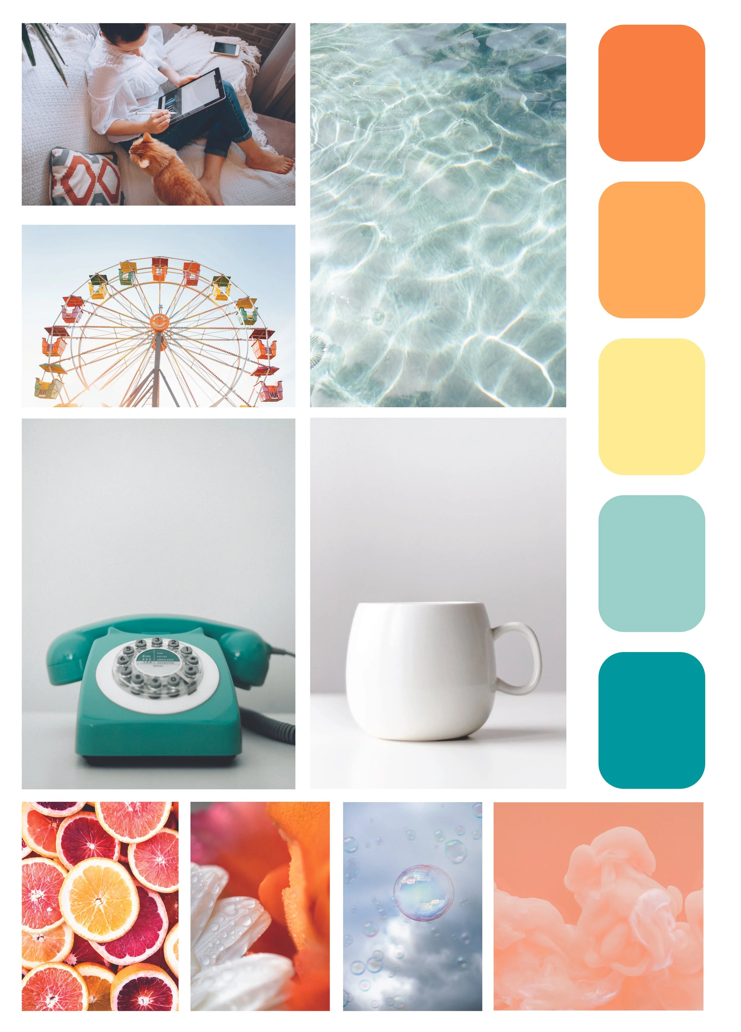
In my pursuit of a unique and functional logo, I tested shapes, typefaces, and colors for a combination that worked together.
Strategy
Aesthetics
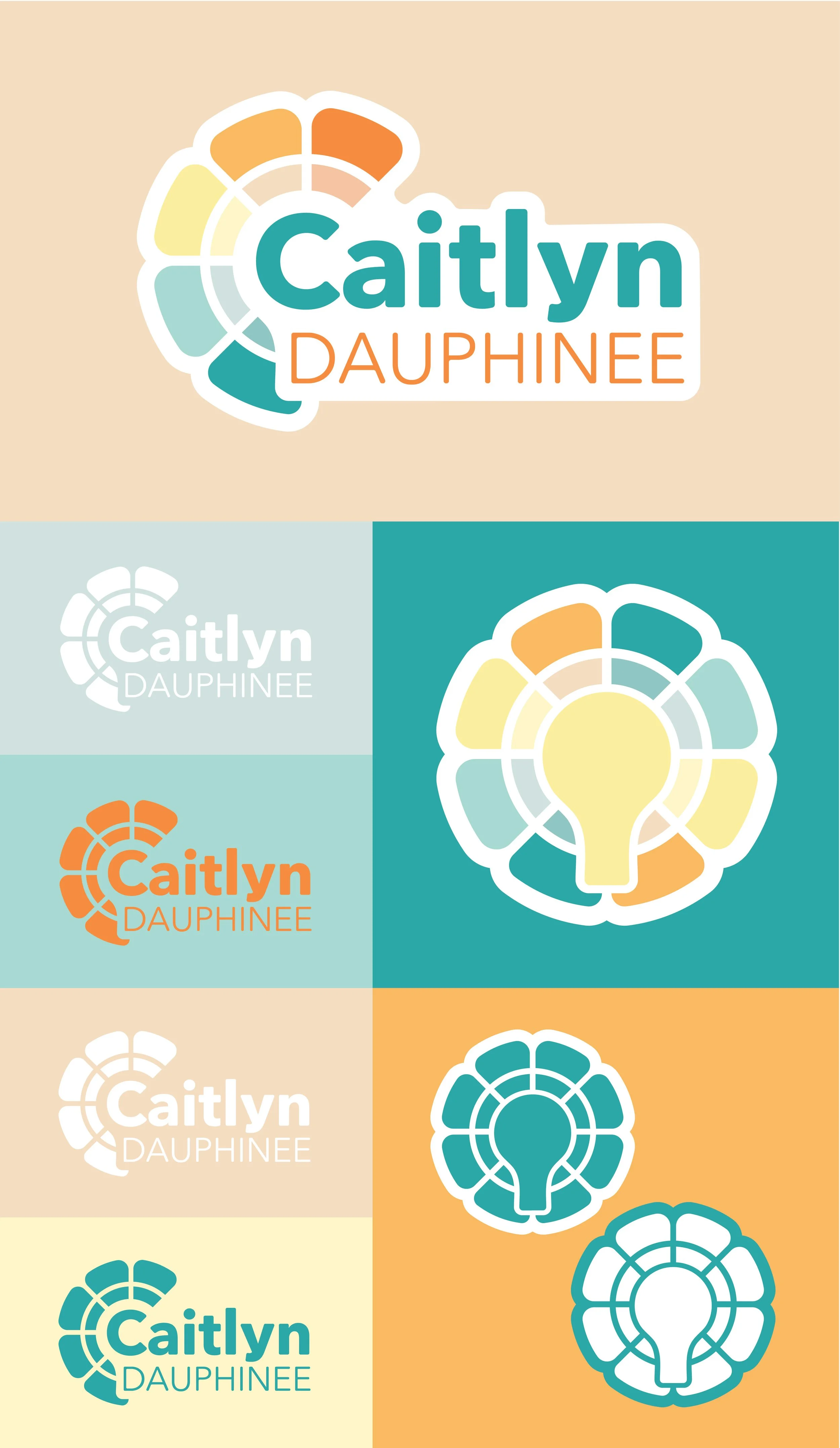
The final logo combines three shapes: a flower, a lightbulb, and a color wheel. Some of these elements are more subtle, and function as a fun Easter egg for those who notice them. These shapes work well together and frame the word mark of the logo.
The colors are bright and cheery complimentary colors that play well together.
Function
The three elements of the icon communicate different aspects of me and my work. The flower communicates friendliness. The lightbulb stands for ideas. The color wheel is a foundational tool used in graphic design.
I chose a simple sans serif font that matched the style of the icon. It’s easy to read and has rounded corners to keep the soft look of the flower petals. The text is balanced and fits comfortably within the icon shape.
The additional variations of the logo allowed me to use it in any scenario.
Results
I used this logo on paperwork, stickers, business cards, and even a sign. Many people have commented on the design, saying it’s clever and easy on the eyes.