Graphic Design Handbook
Background
I became aware that many people don’t understand graphic design or why it’s important. I didn’t even know what graphic design was before I started college!
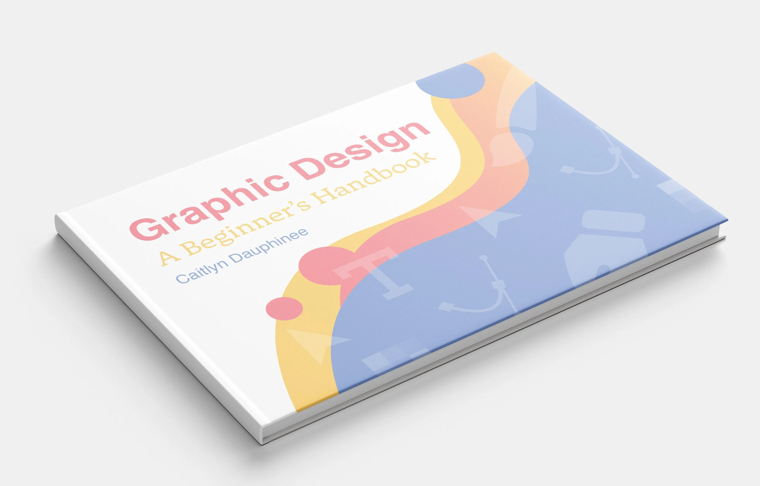
I decided to create a handbook that could explain the basics of graphic design at a high school level to help students develop a knowledge and interest in the field.
Research
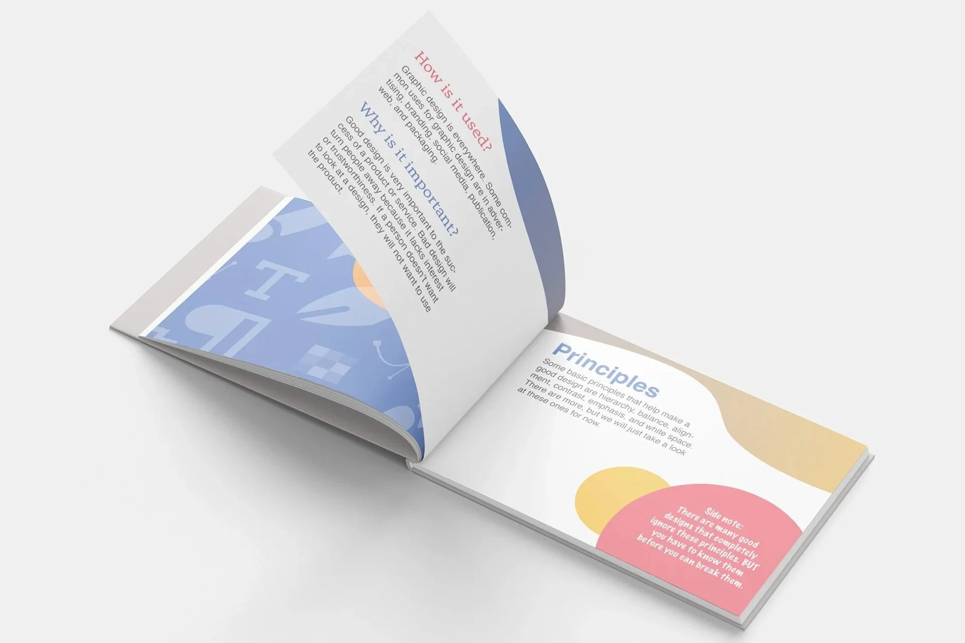
I familiarized myself with basic design principles to create the content for this book. Choosing which ones to focus on was an important part of creating a project that could educate without being overwhelming.
Strategy
Aesthetics
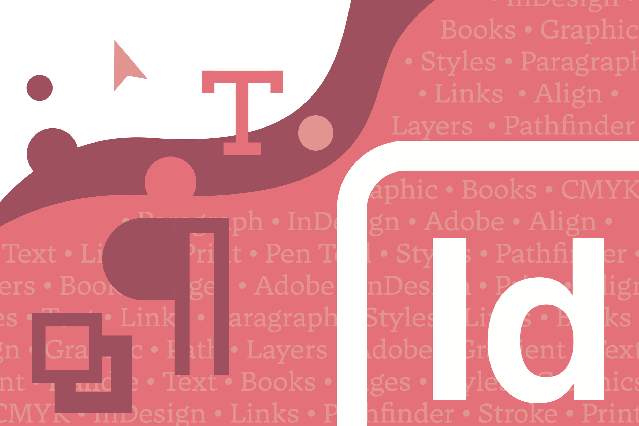
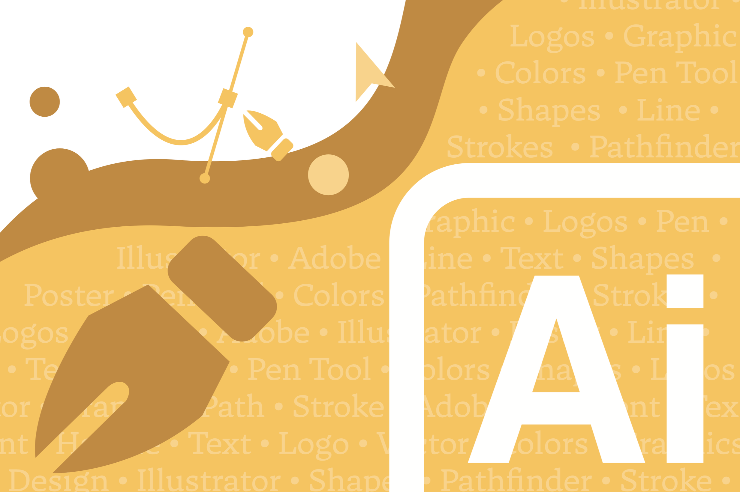
I used colorful gradients and familiar icons from Adobe design software to add visual interest to the design. This energetic, colorful style appeals to the younger demographic and ensures that this educational resource is still engaging.

Function
Since this project would be a foundational resource for an understanding of graphic design, I employed several classic design choices. Primary colors emphasize learning the basics. The Helvetica typeface ensures clean and legible text. Guidelines like the Golden Ratio and Rule of Thirds provide balance and structure.
Results
From story, to concept, to print, this book was a great example of design that works. It appeals to the target market, presents educational material in a clear and legible way, and encourages interaction. This project combined my love for publication design with my passion for educating people about graphic design.