Devotional
Background
This book was the ultimate exercise of typesetting and layout design. The design required more than six individual page designs, over two dozen paragraph styles, and nearly fifty images. Organization was crucial for the success of this project, and required a systematic approach to design and file handling.
Francie’s goal was to create a resource that would be calming, engaging, and beautiful. She wanted women to be attracted to the cover and compelled by the interior. The design was meant to encourage interaction with the written material.
Research
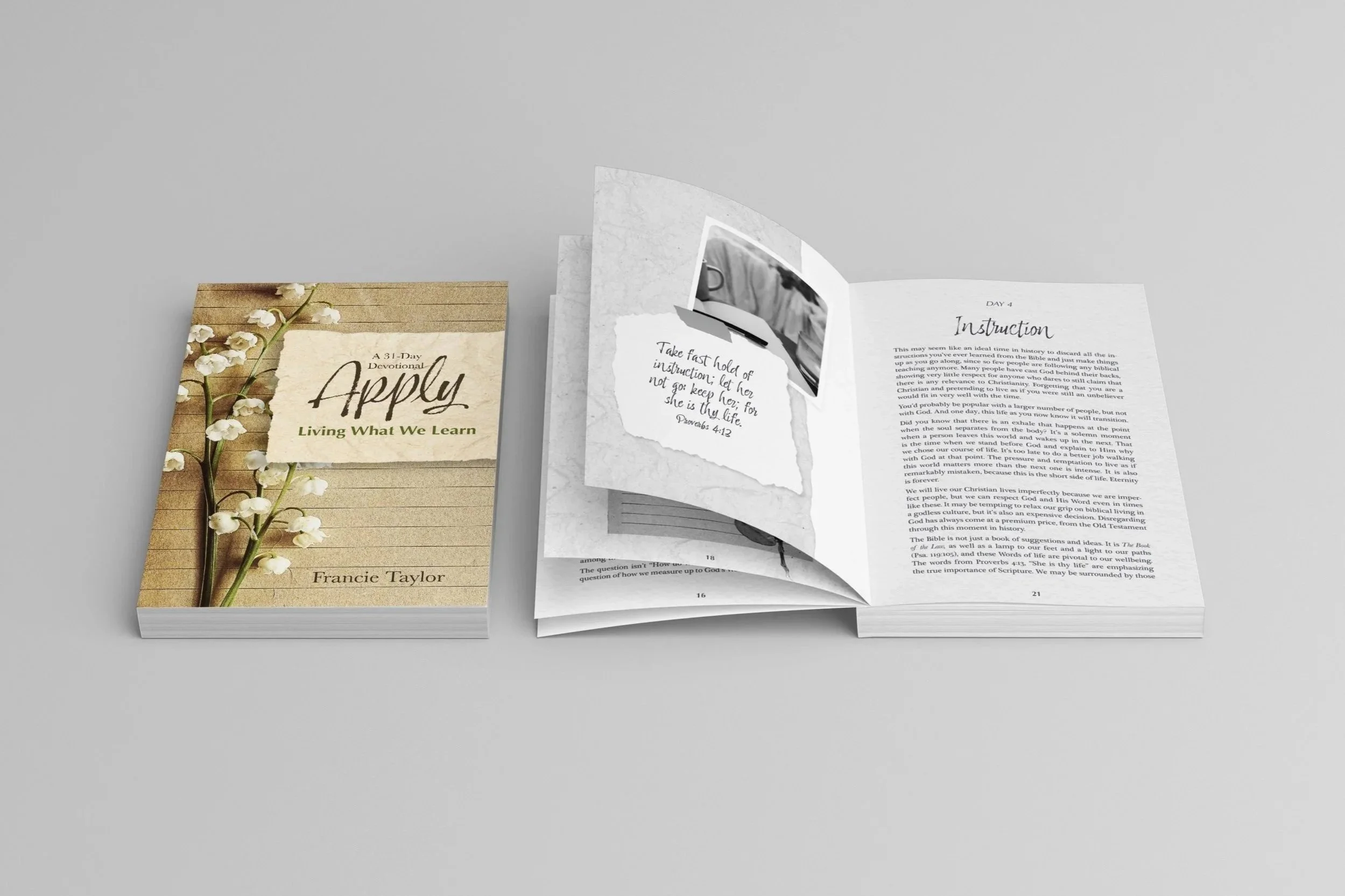
Because the title and content communicated referred to active application, I wanted the cover to reflect that message. Abstract concepts can be difficult to capture in an image, especially when they are being applied to life or religion.
I explored concepts related to gardening, baking, and journaling. Each of these ideas had potential to look good, but only one would work for this project.
Strategy
Aesthetics
A journaling style is engaging and attractive, and it reflects the theme of the book. However, the trick was to use this concept in a classy way without being cliche or cheesy. Paper textures tend to be overused in graphic design, so I intended to implement them subtly and with purpose.
Function
Due to the variety of text styles and page types in this book, hierarchy was a priority. The material needed to be presented in a way that was easy to read and didn’t overwhelm or tire the reader. Headings needed to stand out from body copy to show clear direction and separation.
The text was printed in 80% black on cream paper to make the reading experience more pleasant and less strenuous on the eyes. I chose a justified alignment for balance and structure. And things like leading, keep options, and image placement were adjusted for appropriate spacing and legibility.
Results
Work on this project resulted in a beautiful, functional, cohesive book that would attract and retain readers to the last page. The elements from the cover echoed throughout the layout, creating a unity that silently supports the content that the author wrote.
This book became a best-seller for Keep the Heart, and I continue to gain new clients as a result of referrals stemming from this project.
Client Review
“I've known Caitlyn since her senior year at Pensacola Christian College, where she studied and excelled in graphic design. Caitlyn was in my Senior Bible class on Sunday mornings, and I learned of her background in graphic design before class one morning. After seeing samples of her work, I knew she was the one to run the next book design project for Keep the Heart LLC.
Caitlyn hears words and sees the design. She took a simple, one-word book title, "Apply," and turned it into our best-selling book of 2024. It continues to be our best-performing book, and we are convinced that this is due in part to Caitlyn's inspiring design.
An author who saw our book inquired about the designer, and is now one of Caitlyn's clients.
Caitlyn is a visionary designer, and we look forward to working with her on future projects. I highly recommend Caitlyn for your design projects as well.”
Francie Taylor
Co-Founder of Keep the Heart