Coffee Company
Background
The client came to me with his idea for a start-up: a coffee company that directly supports Christian missionaries through sales and marketing. He wanted the visual identity to appeal to young adults who want to do something meaningful while making a routine purchase like coffee.
Research
In order to create a visual identity that appeals to the target market without being cliche, I needed to spend some time researching the market. I looked at the logos of many coffee companies, taking note of the unique ones that did not feature a coffee bean of mug. Avoiding these visual cues was important for distinction in the oversaturated market. The challenge came in when trying to represent a coffee company without common imagery in the logo while also tying into the greater purpose behind the business.
I created hundreds of initial concepts and presented polished versions of a few of them to the client to ensure that we went in a direction that aligned with his goals for the business.
Strategy
Aesthetics
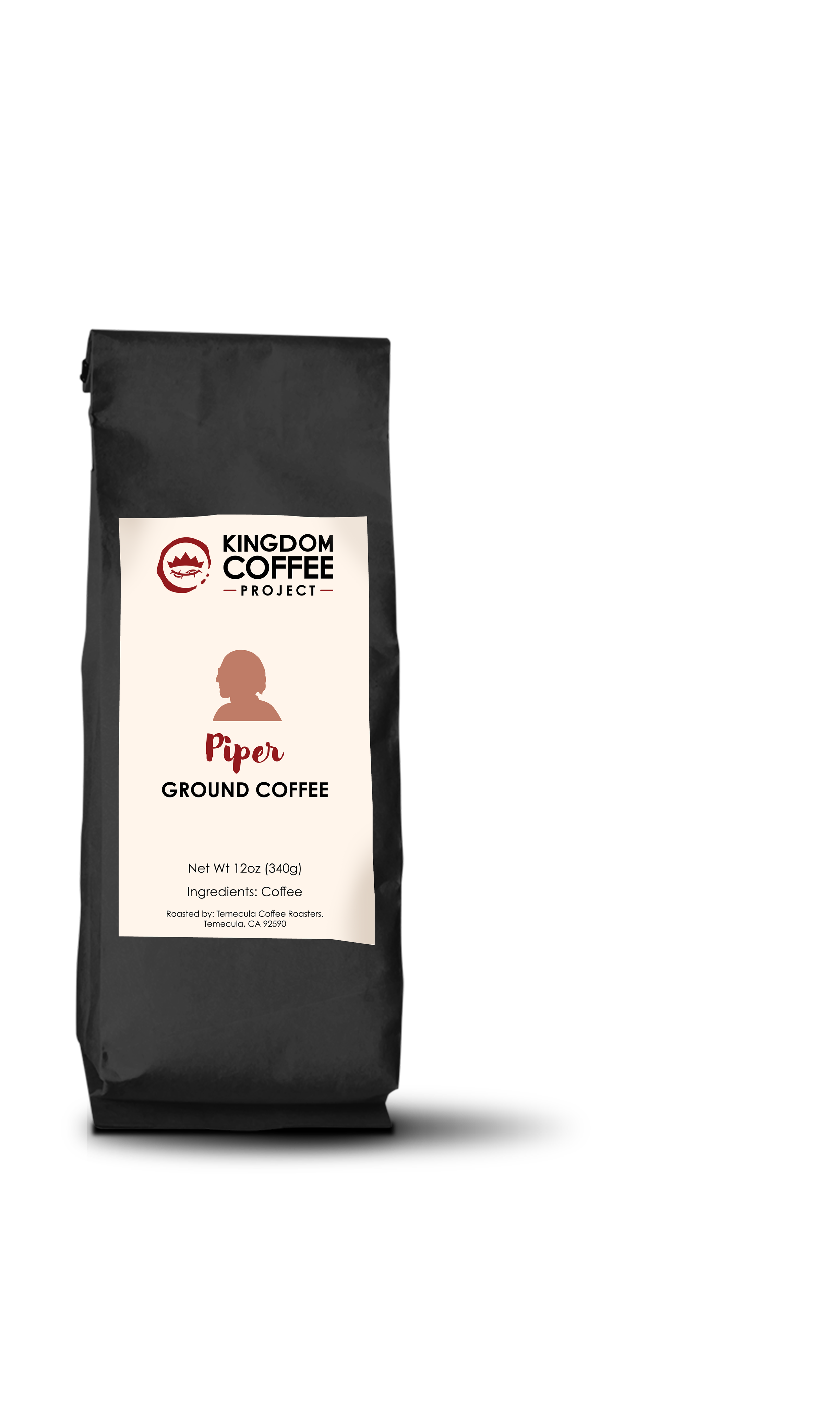
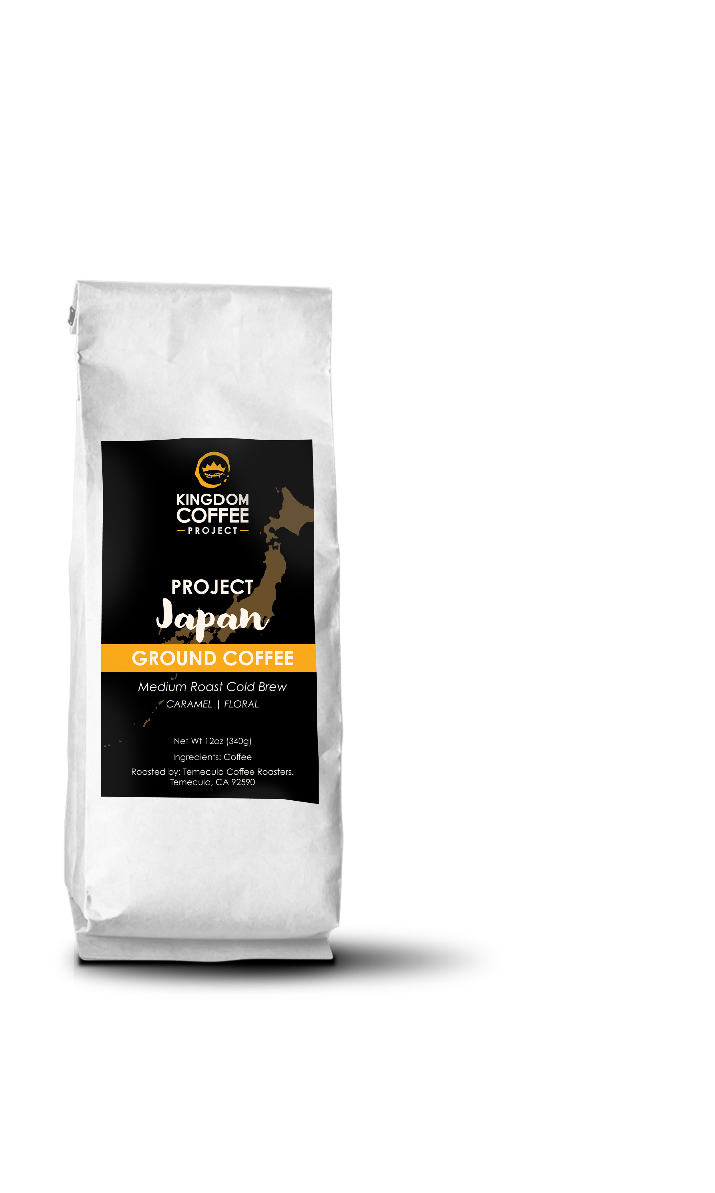
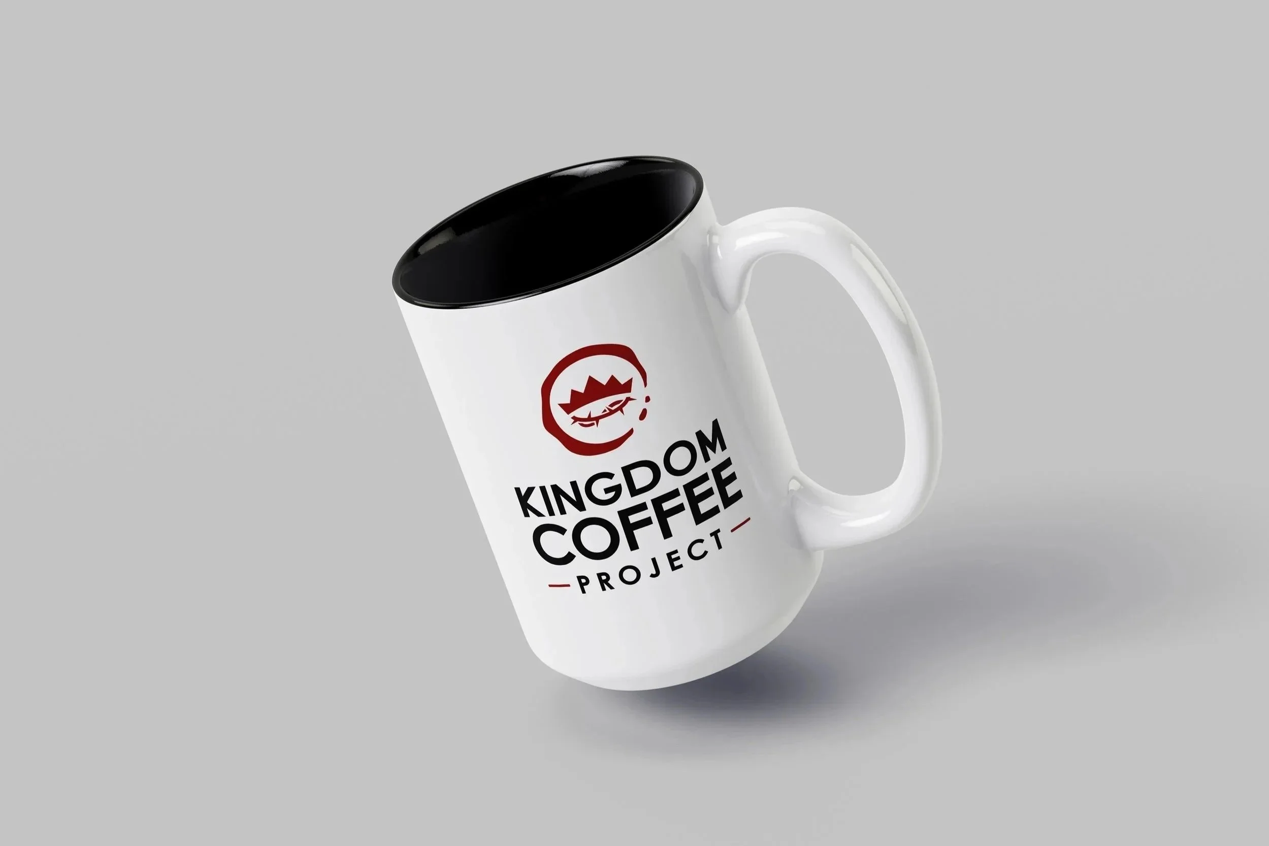
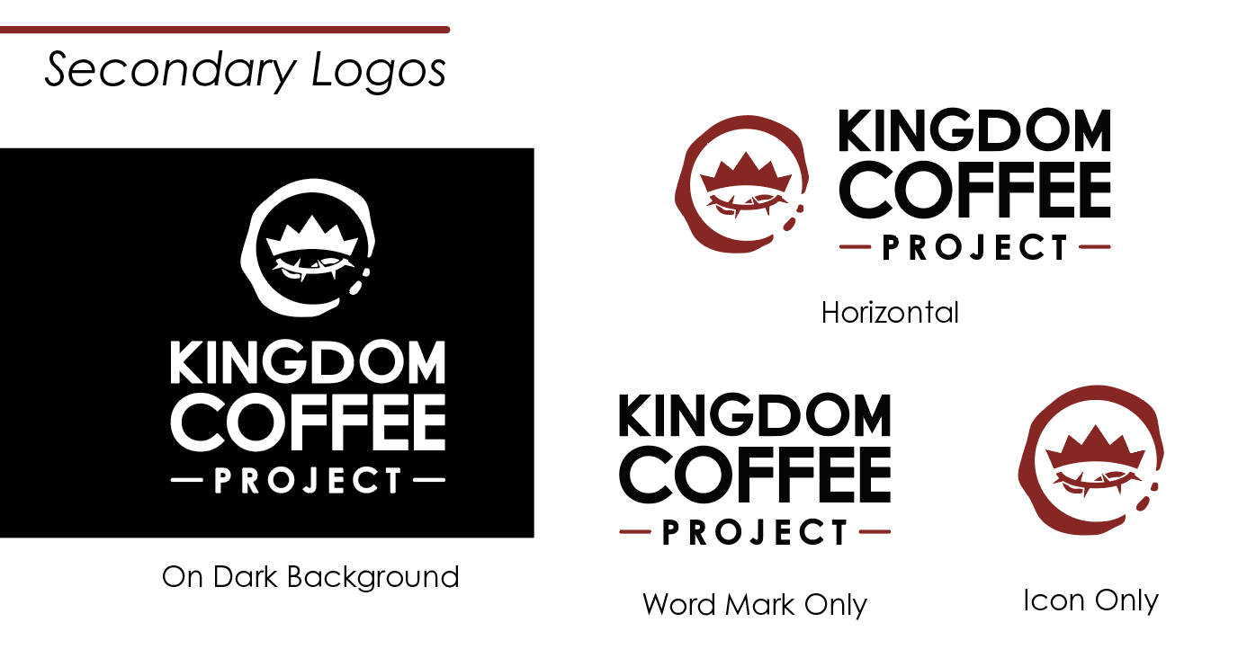
We went with a clean style with a bit of grit and moodiness for a down-to-earth feel. The main icon combines a crown with a crown of thorns (a popular Christian symbol) within a coffee stain that frames and unifies the design. The typography is simple and bold, giving a feeling of authority and purpose. The colors tie into the idea of royalty, and the imagery features dark, warm, familiar elements that inspire action in the form of purchasing coffee or promoting the cause.
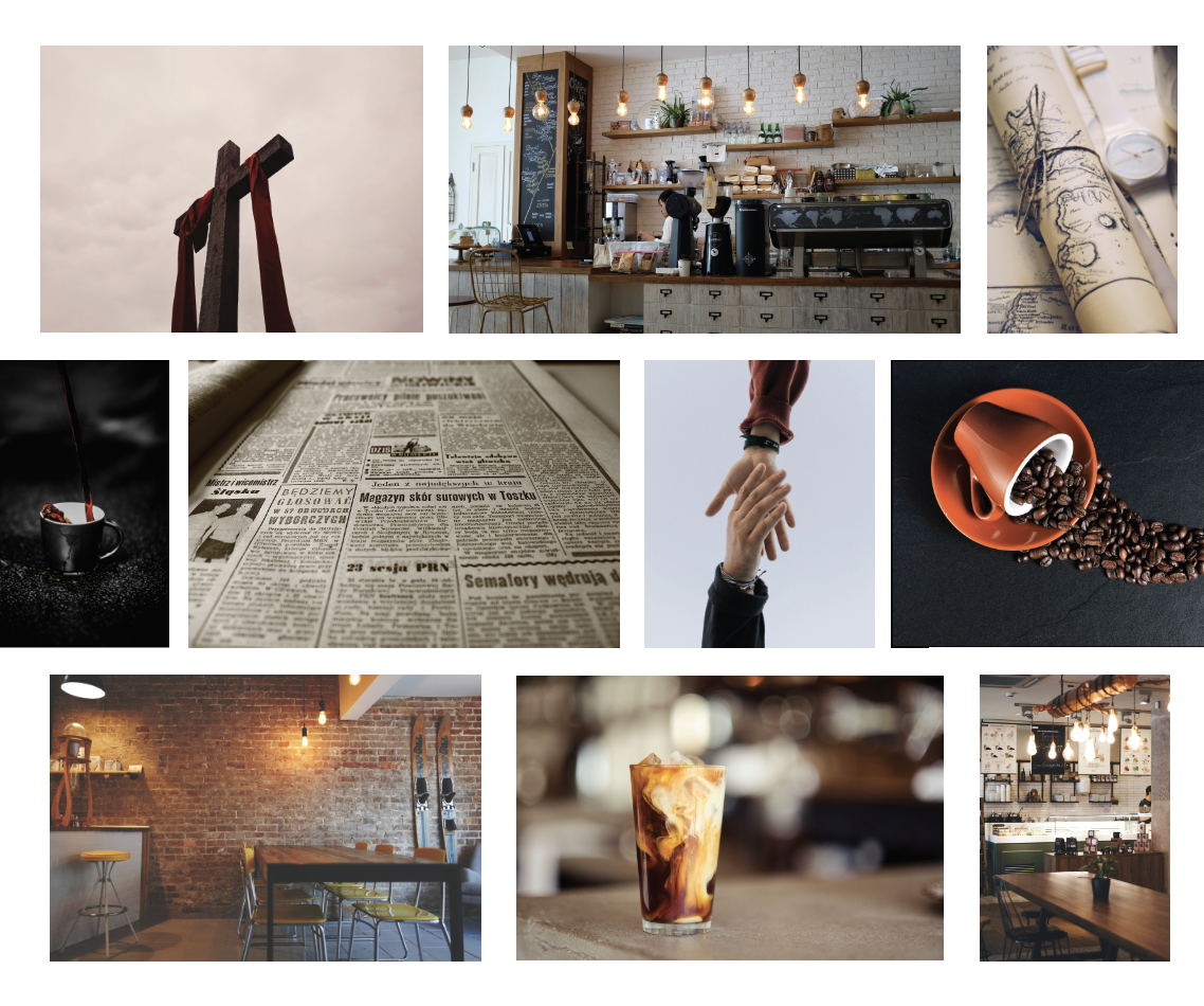
Function
The visual elements speak to a young adult audience that is purpose-driven and practical. This is exactly who we wanted to attract. The fonts are easy to read and catch attention mid-scroll. The logo can be utilized in a variety of scenarios due to the multiple variations.
Results
The visual elements for this startup carried over into packaging, advertising, social media, and website design. Though still in the early stages, Kingdom Coffee Project has sold several bags of coffee and is already contributing to missions.