Biography
Background
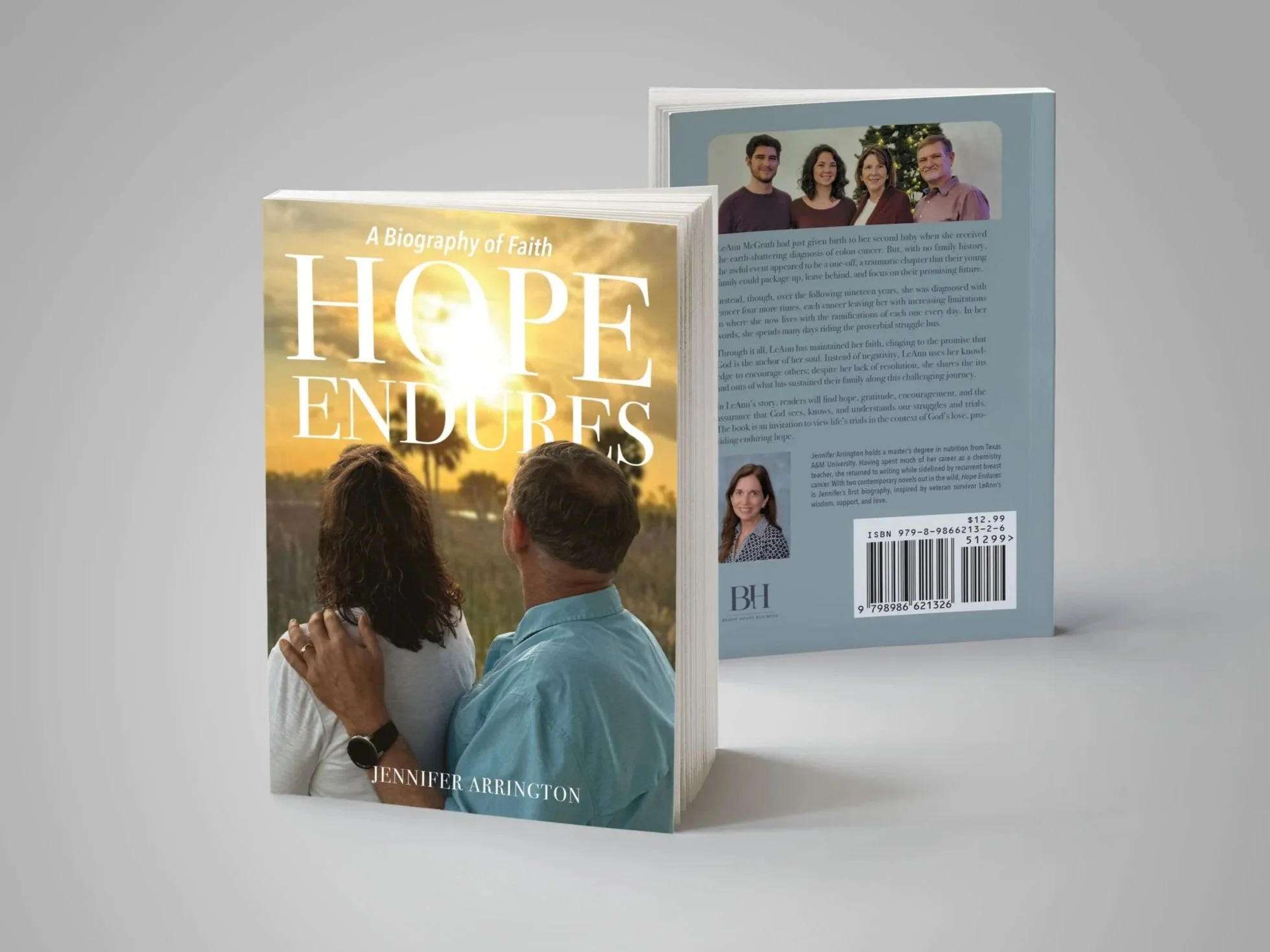
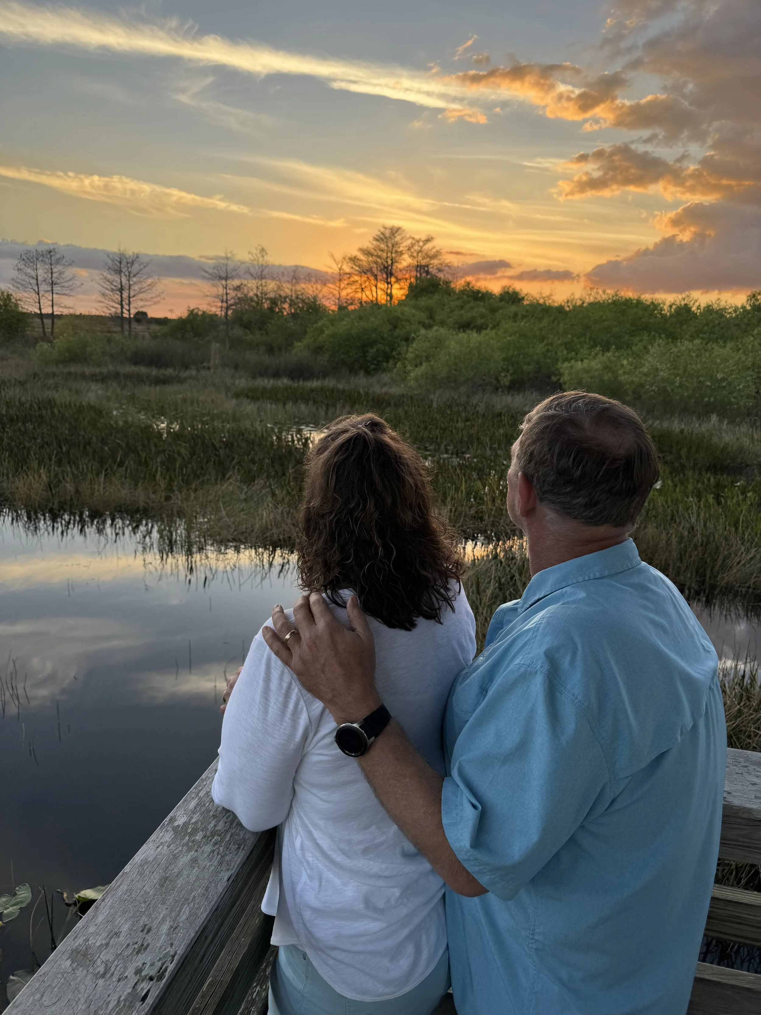
The goal for this book cover was to create a design that would work well with the title to clearly communicate the main message of the book: hope. Since this is a nonfiction work, the author wanted to include images that portrayed the actual subjects of the story.
Research
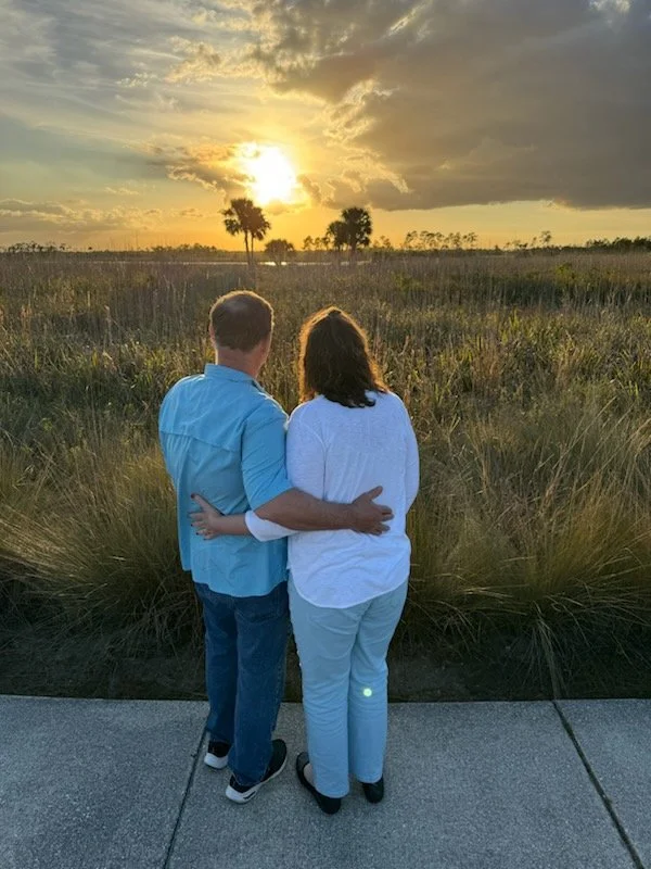
Photo editing was an important skill that I implemented in this project. Jennifer gave me several photos to use, and I decided to combine two of them for the desired look. I took the couple from one image and superimposed it onto the background image to make the couple look like they’re enjoying the sunset.
Strategy
Aesthetics
The concept for this cover was simple: use the provided photos to convey the idea of hope. The challenges of this process included color harmonization between two different images, manipulating clarity to create a sense of depth, and cleanly extracting and placing the subjects to avoid distraction caused by outlines or gaps.
Function
The typography for this project was just as important as the imagery. White text on a light sky can cause some legibility issues. Because of this, the font needed to reflect the mood of the book while still being practical. Most people view a book cover on a shelf or Amazon page for a minuscule amount of time before moving on, so a thin script font would not have enough visual presence to be easily read at a glance. I chose an elegant serif typeface to suit the story, and ensured that it would be just heavy enough to stand out from the background. The placement provides some interest with the sun shining through without compromising legibility.
The back cover, though often an afterthought, is still important. This space provides additional information about the content, and must be designed in a way that presents the information clearly. I placed all the elements with room to breathe and ensured that all text was easy to read.
Results
The author and subjects were very pleased with the end result. I had the opportunity to work with Jennifer again as a result of the success of this project.
Client Review
“I’ve had the pleasure of working with Caitlyn Lamper on two book cover projects, and I couldn’t be more impressed. Caitlyn has an incredible talent for transforming my ideas into polished, professional designs that I’m proud to showcase. She’s well-versed in platform requirements, expertly adjusting sizing and file types as needed. If a submission gets rejected, Caitlyn quickly translates technical jargon into actionable solutions, ensuring everything is resolved efficiently. Beyond her artistic skill, Caitlyn’s patience and positive attitude make her an absolute joy to work with. I highly recommend her to any author seeking a skilled and reliable cover designer..”
Jennifer Arrington
Author, Beach House Business