Bible Study
Background
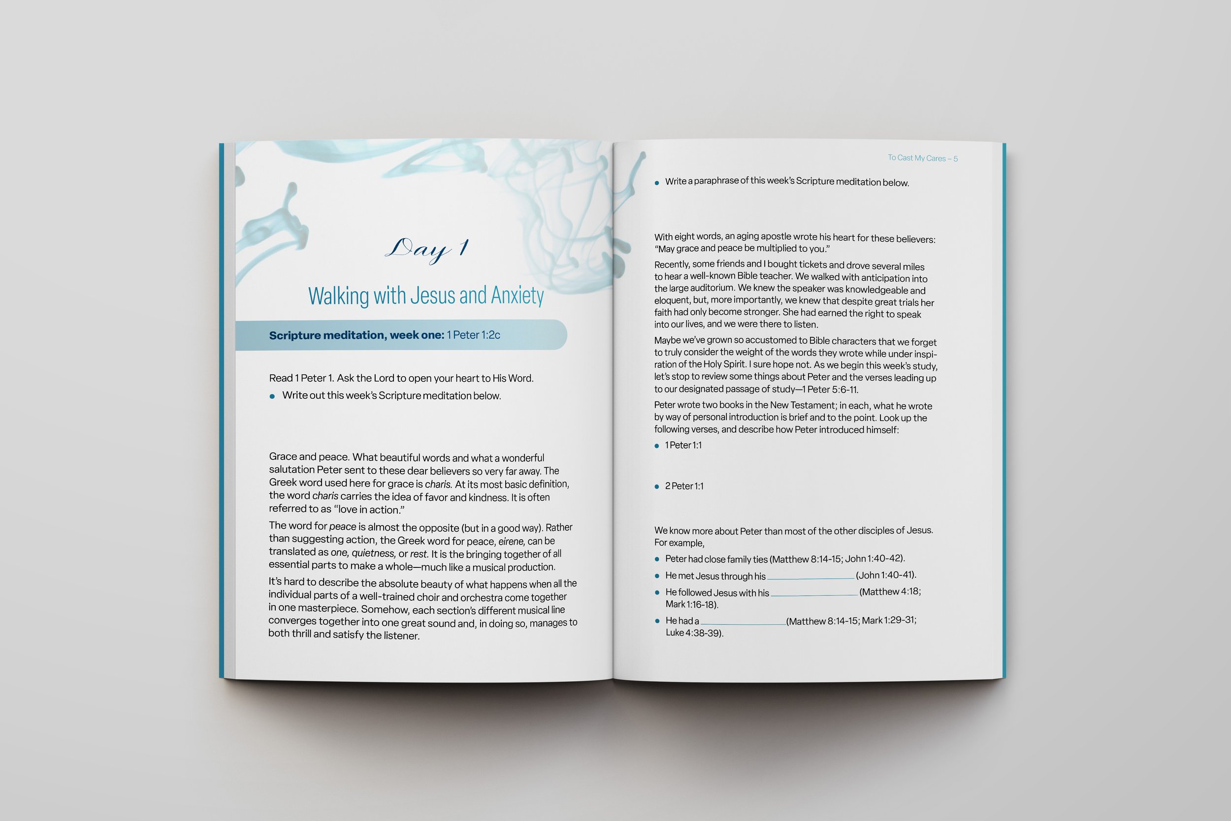
This Bible study project began with two distinct challenges: create a gender-neutral design, and manage multiple interior visual elements and levels of hierarchy. This project involved more than thirty text styles, applied on every page to maintain consistency and visual hierarchy for clarity. The book contained graphs, charts, tables, illustrations, body copy, pages for writing, bullet points, lists, and images. To create a book that would work for the reader, I would need to create a distinct visual style for each element.
Research
Many books written about peace are given soft, feminine cover designs. The author wanted her book to relate to and attract both men and women, so using cliche symbolism was not an option. For this project I needed to understand the visual cues that generally relate to designs that are considered feminine or masculine.
Strategy
Aesthetics
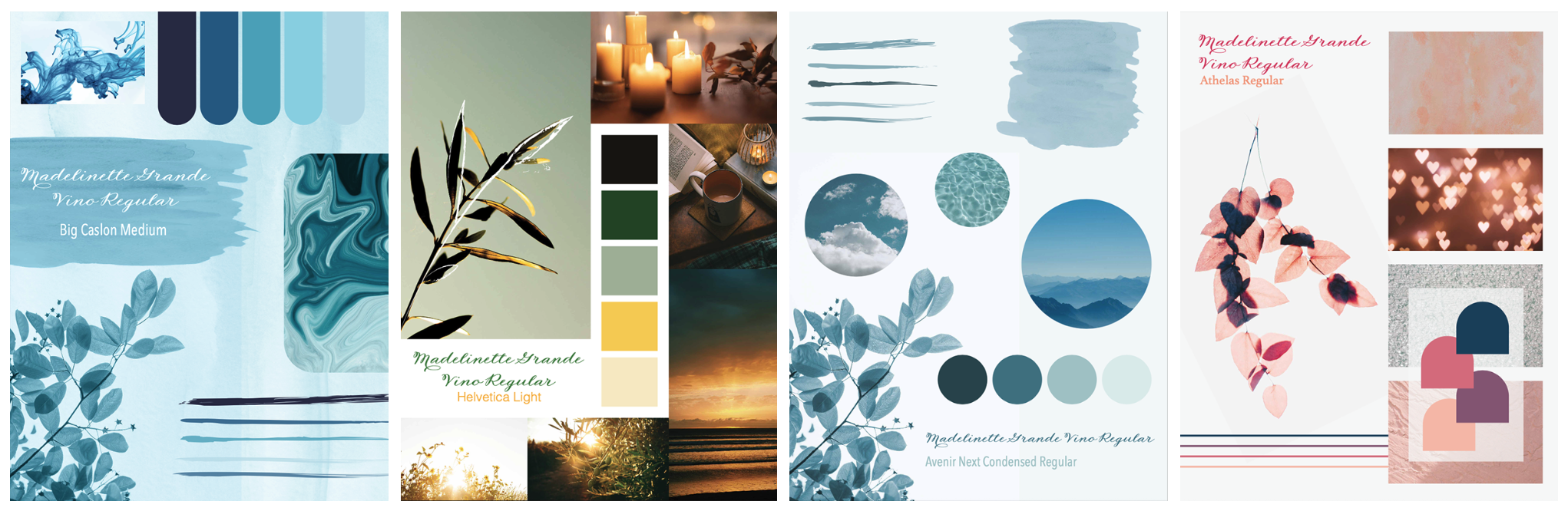
One of the first steps in my design process (after research and briefing) is to create at least 3 mood boards for the client. This helps us decide on a general direction and style for the project. Referring to the chosen mood board keeps me on track and helps the client visualize the possibilities of the final design. The final design was based on the first mood board in this series.
Function
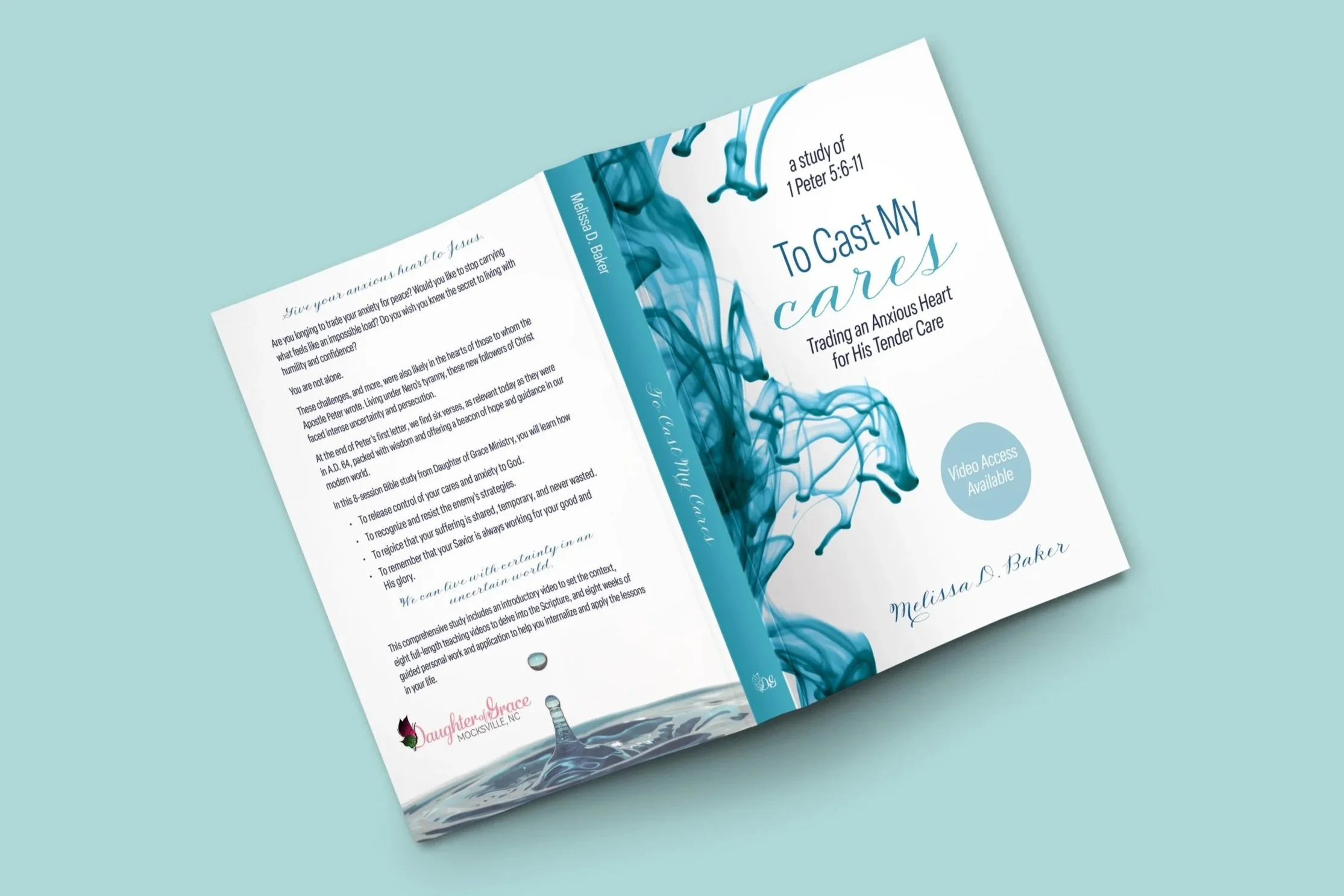
Aside from visual aesthetics, the imagery serves a practical purpose as well. They are used throughout the book to create harmony with the cover and provide a consistency that the reader can count on to subconsciously guide them through the content. The shapes frame the text and appear the same way on each type of page. This, along with distinct heading styles, signals the start of each new chapter and other important cues.
The typography serves an important role in creating a pleasant and functional reading experience. I managed running head content, lines and words separated from their paragraphs, content edits implemented during the design process, and space required for writing answers.
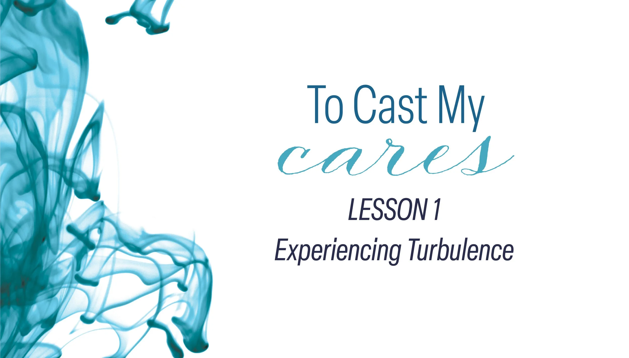
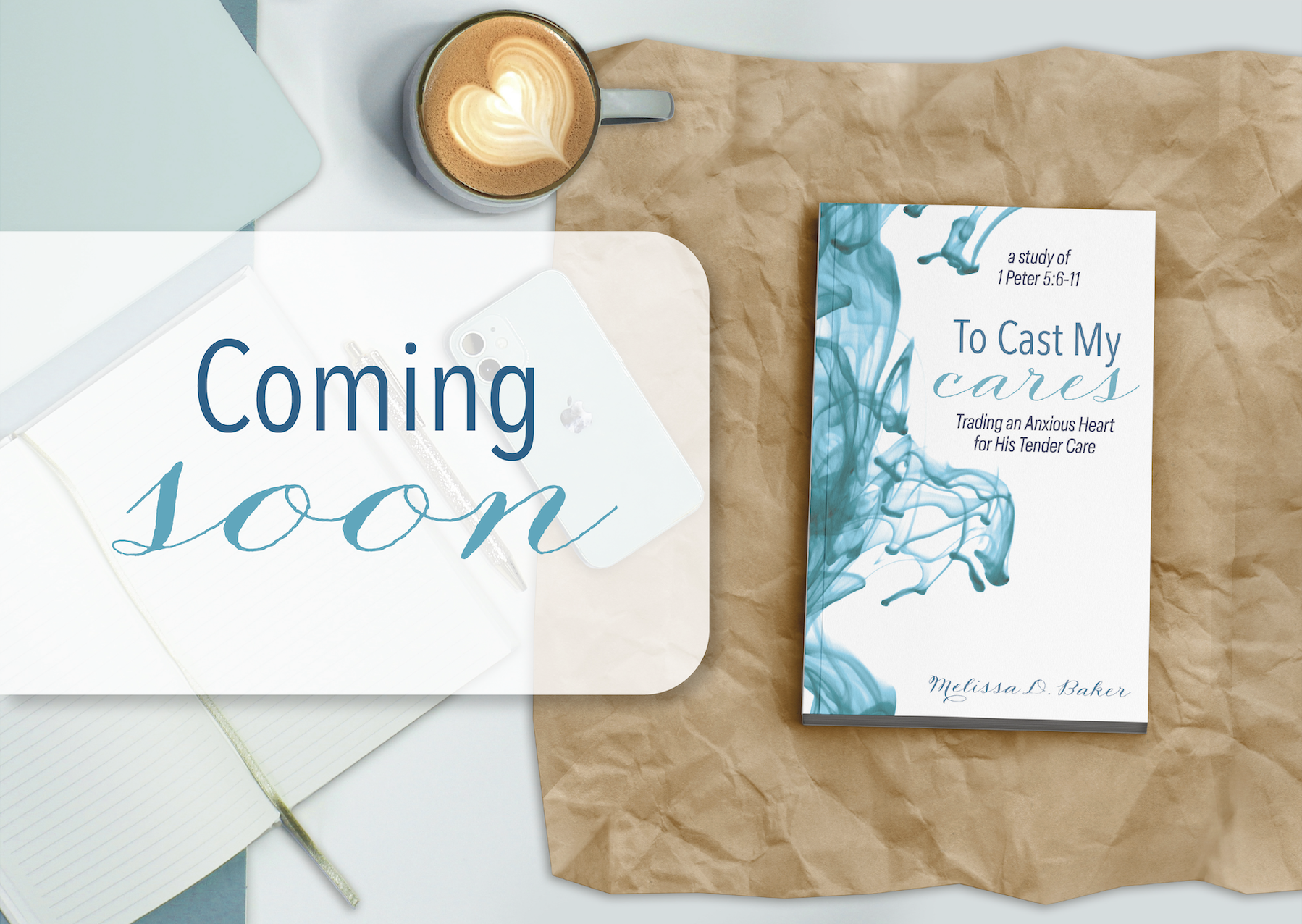
I chose two images of water to communicate the intended message. The chaotic swirls of ink on the cover and first page of each chapter communicate inner turmoil. The more peaceful droplet on the back cover and final spread of each chapter repeatedly bring the viewer back to a sense of visual peace. This design choice is subtle, but meaningful and impactful.
Results
This book came together in an intentional, practical, and visually enjoyable end product. Melissa also hired me to design slides for the video content and advertisements to promote the new book. Both of these supporting elements were created to be visually cohesive with the book itself.
Within a week of publishing, this book ranked #27 in the Anxieties and Phobias category on Amazon.
Client Review
“Caitlyn was a delight to work with. Her expertise, positive spirit, and work ethic delivered in every way. Not only did she quickly lean into the heartbeat and focus of my project, but she knew how to convey them with insightful, quality visuals. If you are looking for someone to catch your vision and work enthusiastically with you until you reach your goals, look no further, Caitlyn Lamper is the graphic designer you want.”
Melissa Baker
Author and CEO of Daughter of Grace Ministry